
UX / UI Designer: The Complete Global Career Guide (2026-27)
Every app you use, every website you visit, every digital product you interact with was shaped by a designer. The button you tap to confirm a purchase, the navigation menu that helps you find what you need, the onboarding flow that makes a new tool feel intuitive rather than confusing — these are not accidents. They are the result of deliberate, skilled design work. The professionals who do this work are UX (User Experience) designers and UI (User Interface) designers, and the global demand for their skills has grown steadily alongside the digital economy that depends on them.
What makes this field particularly interesting as a career is that it sits at a genuinely rare intersection. Design requires creative thinking — the ability to imagine solutions that do not yet exist and to communicate them visually. But it also requires analytical thinking — understanding user behavior through research, testing assumptions, and iterating based on evidence. And it requires communication skill — presenting work to stakeholders, collaborating with developers, and advocating for the user’s perspective in decisions that involve competing priorities. Very few professions demand all three of these capabilities at once, which is part of why excellent designers are consistently hard to find and why the field rewards those who develop genuine depth.
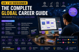
This guide covers what UX and UI design actually involve, the skills and tools that professional designers use, how to build a portfolio that gets you hired, where global demand is concentrated, how to break into the field, and how a design career typically develops over time.
UX and UI: Understanding the Distinction and the Overlap
The terms UX and UI are often used interchangeably, but they describe related and distinct bodies of work. Understanding the difference helps you identify where your interests lie and how the roles are typically structured in different organizations.
User Experience Design (UX)
UX design is concerned with the overall experience a person has when interacting with a product. It asks questions like: Is this product easy to understand? Can users accomplish their goals without confusion or frustration? Does the product actually solve the problem it is supposed to solve? Are there points in the user journey where people get stuck, give up, or make errors?
UX designers work to answer these questions through research and design. They conduct user interviews and usability tests to understand how real people interact with a product. They map out user flows — the sequence of steps a user takes to accomplish a specific goal — and identify where that flow breaks down or creates friction. They create wireframes and prototypes — low-fidelity representations of a proposed design — that can be tested with users before significant development effort is invested. They synthesize research findings into insights that inform design decisions and communicate those insights to product teams.
UX design is inherently iterative. A design is proposed, tested with users, refined based on what the testing reveals, tested again, and refined again. This cycle continues throughout the product development process and does not stop when a product is launched — live products continue to be researched, analyzed, and improved based on user behavior data and feedback.
User Interface Design (UI)
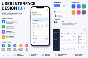
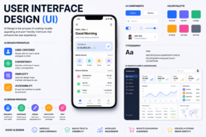
UI design is concerned with the visual and interactive qualities of a product’s interface. Where UX design asks “how does this work for the user?”, UI design asks “how does this look and feel?” UI designers make decisions about typography (which fonts to use, what size, at what weights), color (the palette that defines the product’s visual identity and communicates meaning), spacing and layout (how elements are arranged on the screen and how much space exists between them), iconography (how icons are designed to communicate meaning clearly), component design (how buttons, form fields, navigation elements, cards, and other interface components look and behave), and animation (how interfaces respond and transition in ways that feel natural and provide feedback).
UI designers work within the structure established by UX design — they are not making architectural decisions about how the product works, but making the visual and interaction design decisions that determine how the product feels. A product with excellent UX but poor UI may work correctly but feel visually unappealing and unpolished. A product with excellent UI but poor UX may look beautiful but be difficult to use. The best products have both.
How the Roles Interact in Practice
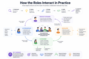
In many organizations — particularly smaller companies, startups, and agencies — a single designer handles both UX and UI work, wearing both hats across the design process. This is sometimes called “product design” to reflect the integrated nature of the role. In larger organizations, UX and UI may be more clearly separated, with UX researchers handling the discovery and testing work while UX designers handle flows and wireframes and UI designers handle visual design.
Understanding both dimensions of design — even if you ultimately specialize in one — makes you a more effective designer and a more versatile professional.
Core Skills Every UX/UI Designer Needs
User Research Methods
Design that is not grounded in understanding real users is not user experience design — it is decoration with good intentions. User research is what connects design decisions to evidence about how people actually think, behave, and feel when interacting with products.
User interviews are structured conversations with people who represent the target audience for a product. The goal is to understand their mental models, their goals, their frustrations with existing solutions, and how they think about the problem the product is trying to solve. Effective user interviewing is a skill — it requires asking open questions that do not lead the respondent, listening actively without interrupting, probing for specific examples rather than accepting generalizations, and resisting the temptation to pitch your own design while talking to research participants.
Usability testing involves observing real users attempting to accomplish specific tasks with a product or prototype. The goal is to identify where the design creates confusion, where users get stuck, and where their mental model of how the product works differs from the design’s assumptions. Usability tests can be conducted in person with a facilitator guiding the session, or remotely using tools like Maze, UserTesting, or Lookback. Even five to eight participants in a usability test typically reveals the most significant design problems.
Surveys and questionnaires allow designers to gather data from larger numbers of users than interviews permit. They are useful for quantifying attitudes, measuring satisfaction, and identifying patterns across a broad sample. Their limitation is that they cannot capture the nuance and context that interviews provide.
Card sorting and tree testing are specific research methods used to understand how users expect information to be organized. Card sorting asks participants to group content into categories that make sense to them, revealing the mental models that should inform information architecture. Tree testing asks participants to find specific information within an existing or proposed navigation structure, revealing where that structure works and where it does not.
Analytics and behavioral data — from tools like Google Analytics, Mixpanel, Amplitude, and Hotjar — provide quantitative data about how users actually behave in a live product. Heatmaps show where users click (and where they do not), session recordings show exactly how individual users navigate through a product, and funnel analysis shows where users drop off in a flow. Analytics data tells you what is happening; research methods help you understand why.
Design Thinking and Problem-Solving
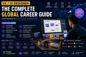
Design thinking is a structured approach to creative problem-solving that begins with understanding the human context of the problem, then defines the problem clearly, generates a wide range of potential solutions, builds prototypes of the most promising ideas, and tests them with real users. This process — Empathize, Define, Ideate, Prototype, Test — is not a strict linear sequence but a flexible framework for approaching complex problems where the right solution is not obvious from the start.
The most important design thinking habit is resisting the temptation to jump to solutions. Designers are creative people, and creative people often experience the urge to start designing before they fully understand the problem. The investment in research and problem definition at the beginning of a project pays for itself many times over by ensuring that the design work is pointed in the right direction.
Information architecture is the structural design of shared information environments — how content is organized, labeled, and navigated. Every digital product is an information architecture problem: how do we organize the features, content, and tools this product contains so that users can find what they need without confusion? Good information architecture is invisible — users simply find what they need without thinking about the structure. Poor information architecture is the source of enormous user frustration and is a common root cause of the problems that usability testing reveals.
User journey mapping is a technique for visualizing the complete experience a user has across their interactions with a product or service — from the initial moment of awareness through the purchase decision, onboarding, regular use, and beyond. Journey maps identify the emotions users experience at each stage, the actions they take, and the pain points that create frustration or abandonment. They are powerful tools for identifying design opportunities and for communicating user needs to stakeholders who are not directly involved in design.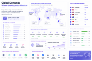
Visual design Fundamentals
UI designers work with visual elements to create interfaces that are both beautiful and functional. The foundational visual design principles that underpin this work are not platform-specific — they are applicable across digital products, print, and any other visual medium.
Typography is one of the most important and most underappreciated elements of interface design. The choice of typeface communicates personality and sets tone. The hierarchy of type sizes and weights communicates the relative importance of information. The spacing between lines and letters affects readability. Most digital products use a limited palette of two or at most three typefaces — typically one for headings and one for body text — with size, weight, and color variation to create hierarchy within those typefaces. Understanding type fundamentals is essential for UI design.
Color theory covers how colors relate to each other, how they communicate meaning and emotion, how contrast affects readability and accessibility, and how to build a color palette that is consistent, purposeful, and accessible. The WCAG (Web Content Accessibility Guidelines) accessibility standards specify minimum contrast ratios between text and background colors that must be met for a design to be accessible to people with visual impairments. Accessibility is not optional — it is an ethical responsibility and, in many contexts, a legal requirement.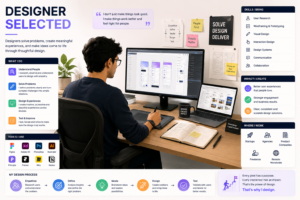
Layout and spacing — often discussed in terms of grids, alignment, and whitespace — determine how information is structured visually on the screen. A consistent grid system provides invisible scaffolding that keeps layouts organized and balanced. Appropriate whitespace (the empty space between elements) is not wasted space — it is what allows individual elements to breathe and be distinguished from each other. Cramped, cluttered interfaces create cognitive load; well-spaced, organized interfaces feel effortless.
Visual hierarchy is the use of size, weight, color, contrast, and position to communicate the relative importance of elements on the screen and guide the user’s attention through the content in the intended order. A good visual hierarchy allows users to scan a screen quickly, understand what is most important, and find what they need without reading every element carefully.
Iconography involves the design of icons — small visual symbols that communicate meaning quickly and without words. Good icons are clear, consistent in visual style, and culturally neutral. Icon design is a specialized skill, but all UI designers need to be able to evaluate icon quality, use icons effectively within interfaces, and understand when icons communicate clearly versus when they create confusion.
Interaction Design and Motion
Interaction design is concerned with how users interact with interface elements — what happens when they tap a button, swipe a card, scroll through content, drag and drop an item, or hover over a link. Well-designed interactions feel natural and provide appropriate feedback that confirms the user’s action was registered.
Micro-interactions are small, purposeful animations and transitions that enhance the user experience in subtle but meaningful ways. The loading spinner that prevents a user from wondering if their click registered. The satisfying animation when a task is marked complete. The subtle shake of an input field when a wrong password is entered. These interactions are small individually but collectively contribute significantly to how a product feels.
Understanding the principles of motion design — timing, easing, duration, and the communication of spatial relationships through animation — is increasingly important for UI designers as the expectation for polished, animated interfaces has grown.
The Design Tools Professional Designers Use
Figma: The Industry Standard
Figma has become the dominant design tool for professional UX and UI designers globally, largely replacing Adobe XD and Sketch in most professional environments. Figma is browser-based (it runs in a web browser without installation, though a desktop app is available), collaborative in real time (multiple designers can work on the same file simultaneously, similar to Google Docs), and free for individual designers.

Proficiency in Figma is now effectively a baseline requirement for professional design roles. Essential Figma skills include:
Working with frames and components — Figma’s frame system structures designs for different screen sizes, and the component system allows designers to create reusable design elements (buttons, navigation bars, card layouts, input fields) that can be placed throughout a design and updated globally when changes are needed.
Auto layout is Figma’s system for creating responsive design elements that adapt when their content changes — a button that automatically widens when its label text is longer, or a list that grows as items are added. Mastery of auto layout is one of the skills that separates efficient professional Figma users from beginners.
Prototyping in Figma allows designers to create interactive prototypes by connecting frames with interactions and animations. These prototypes can be shared with stakeholders for review or with research participants for testing, without any code being written.
Design systems in Figma involve creating and maintaining a library of shared components, styles (colors, typography, effects), and patterns that teams use consistently across products. Working within and contributing to a design system is a standard professional design practice.
Other Important Tools
Adobe Creative Suite — particularly Photoshop and Illustrator — is relevant for designers who work with images, illustrations, or printed materials alongside their digital product design. While Figma handles most digital UI design work, Photoshop and Illustrator remain standard tools for creative and brand design work.
InVision was previously a leading prototyping and collaboration tool and still has adoption in some organizations, though Figma has largely supplanted it for most teams.
Miro and FigJam are virtual whiteboard tools used for design thinking workshops, user journey mapping, affinity diagramming (synthesizing research findings), and collaborative ideation sessions. These tools are particularly valuable for remote design teams and for the collaborative phases of the design process.
Maze, UserTesting, and Lookback are remote user research platforms that allow designers to conduct unmoderated usability tests at scale, gathering video recordings of participants attempting tasks in a prototype or live product. These tools have become increasingly standard for teams that conduct ongoing user research.
Zeplin and Abstract are handoff and version control tools that help manage the transition of design work to development teams. However, Figma’s built-in developer mode has reduced the reliance on separate handoff tools for many teams.
Principle, ProtoPie, and Framer are advanced prototyping tools that allow designers to create high-fidelity, complex interactive prototypes with animations and interactions that are not possible in Figma’s prototyping system. These are particularly useful for motion designers and for communicating complex interaction designs to development teams.
Building a Portfolio That Gets You Hired
A design portfolio is the single most important asset in a designer’s career, and it matters more than any degree or certification. Hiring managers looking at a design candidate spend far more time evaluating the portfolio than reviewing the resume. A portfolio that demonstrates strong user research, clear problem-solving, thoughtful visual design, and the ability to communicate a design process is what converts an application into an interview.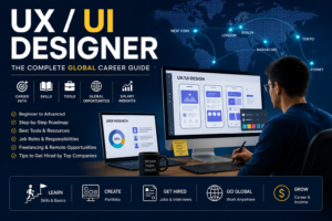
What Belongs in a Design Portfolio
Every portfolio case study should tell a story. Not “I designed a mobile app” — but “here is a specific problem a specific user group was experiencing, here is how I researched and defined that problem, here is how I explored potential solutions, here is the design I arrived at and why, and here is evidence that it performed better than what it replaced.”
The structure of an effective case study typically includes:
The context and problem — what product or project is this, who are the users, and what problem were they experiencing? This section should be concise but specific.
The research process — what did you do to understand the problem before starting to design? User interviews, competitive analysis, analytics review, stakeholder mapping — document what you did and what you learned. This section signals whether you are a designer who solves problems or one who makes things look nice without understanding whether they work.
The ideation and design process — how did you move from insights to designs? Show early sketches, wireframes, and design explorations — not just the final polished screens. The process reveals your thinking, and thinking is what employers are evaluating.
The final design — present the finished work clearly and at an appropriate level of fidelity. Show realistic mockups, annotate interaction details where they are not obvious, and demonstrate the visual design quality.
The outcome — what happened after the design was implemented? Improved task completion rates, reduced error rates, better user satisfaction scores, or any other evidence that the design solved the problem. Not every project will have clean quantitative outcomes, and it is fine to describe qualitative outcomes where quantitative ones are not available.
Portfolio Projects for Beginners
If you are entering the field without professional experience, you need to create portfolio work through other means. Several approaches are effective.
Redesign a product you use and find frustrating. Choose an app or website with genuine usability problems — not a technically poor product, but one where real users experience friction. Conduct your own research (even five user interviews with people who use the product), define the problems you find, propose and design solutions, and document the process. This demonstrates the complete design process in a context where the brief is self-defined.
Design a solution to a problem in your community or daily life. Identify a genuine human problem — navigating an unfamiliar city’s public transport, managing medications, finding accessible venues, connecting local community members around shared interests — and design a digital product that addresses it. The specificity of the problem and the evidence that you have researched it carefully matters more than the sophistication of the visual design.
Participate in design challenges. Platforms like Daily UI provide daily design prompts that build portfolio pieces incrementally. Dribbble and Behance host design communities where work is shared and feedback is given. These platforms are useful for building a visible public portfolio alongside more detailed case studies.
Volunteer your design skills. Nonprofits, community organizations, and small businesses often need design help and would welcome a motivated designer who can improve their digital presence in exchange for a portfolio piece and a reference. These projects provide real constraints — a real brief, a real stakeholder, real feedback — that personal projects cannot fully replicate.
Where to Host Your Portfolio
Personal website built on platforms like Squarespace, Webflow, or Cargo is the most professional presentation. A custom domain with your name establishes a professional identity and demonstrates basic technical literacy. Webflow in particular is worth learning as it is used professionally for web design and also produces polished portfolio sites.
Behance is Adobe’s creative portfolio platform and is widely browsed by hiring managers. Many designers maintain both a personal website and a Behance profile.
Dribbble has historically been a community for showcasing visual UI work — individual screens, animations, and visual design pieces — rather than complete case studies. It is valuable for demonstrating visual design quality and for connecting with other designers, but it is not sufficient as a sole portfolio destination since it does not accommodate the case study format that most hiring processes require.
Notion portfolios have become more common as a simple, flexible format for presenting case studies, though they feel less professional than a dedicated website or Behance.
Global Demand: Where the Opportunities Are
United States
The United States has the world’s most developed UX/UI design industry. San Francisco, New York, Seattle, Austin, and Boston are the primary employment markets, with significant design teams at technology companies, financial institutions, media companies, and consultancies of all sizes. The US market is where product design has been most thoroughly integrated into technology company culture — the expectation that design should have a seat at the table alongside engineering and product management is most established here.
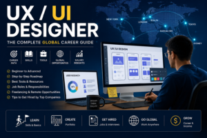
Remote design roles at US-based companies are widely available and represent one of the most significant global opportunities for designers, since design work is entirely digital and location-independent.
United Kingdom
London is Europe’s strongest design market, with a concentration of fintech companies (Revolut, Monzo, and dozens of others), e-commerce brands, media companies, and design consultancies (including the UK offices of global firms like IDEO, frog, and Fjord). The UK design market is particularly strong for service design and design strategy roles alongside product design.
The UK’s Higher Education system has produced strong design talent through programs at the Royal College of Art, Central Saint Martins, and many other institutions with strong design reputations. Competition for junior roles is consequently meaningful, making portfolio quality a critical differentiator.
Germany and Northern Europe
Germany has a strong tradition of industrial and graphic design, and this extends into digital product design — Munich, Berlin, and Hamburg are the primary markets, with significant design employment at software companies, automotive technology firms, and e-commerce companies. The Netherlands (Amsterdam in particular) and Sweden (Stockholm) have vibrant design communities with strong startup and technology employer bases.
Scandinavian design culture has a distinctive aesthetic tradition — clean, functional, human-centered — that aligns closely with the principles underlying good UX design, and Scandinavian companies often have strong design cultures as a result.
Australia
Australian design market has matured significantly, driven by the rapid growth of fintech, healthtech, and e-commerce sectors. Sydney and Melbourne are the primary markets, with remote work increasingly normalizing access to opportunities from other states. Australian employers generally follow US and UK trends in design practice, often implementing them one to two years later, which means designers who are familiar with current US/UK practices bring genuine competitive advantage.
Singapore and Asia
Singapore is the most sophisticated design market in Southeast Asia, with strong demand from financial services, government digital services, and technology companies. The city-state’s Smart Nation initiative has driven significant investment in digital product design for government services.
Japan has a distinct and sophisticated design culture, and Tokyo is a significant market for UX/UI designers with both Japanese language proficiency and digital product design skills. China has a massive and rapidly evolving design industry, though the platform ecosystem (WeChat, Alipay, Alibaba) differs significantly from the Western internet and requires platform-specific knowledge.
Breaking Into UX/UI Design: Career Change and Entry-Level Paths
UX and UI design is one of the more accessible fields for career changers, for a specific reason: the skills that make designers excellent — empathy, analytical thinking, communication ability, attention to detail, and a systematic approach to problem-solving — are developed in many other fields and transfer directly into design.
People who have transitioned successfully into UX/UI design include former teachers (who understand pedagogical clarity and how people learn), psychologists (who understand human cognition and behavior), software developers (who understand technical constraints and can communicate effectively with engineering teams), writers and journalists (who understand how to communicate clearly and how to structure information), product managers (who understand business context and stakeholder dynamics), and many others.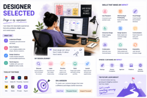
The path into design for a career changer typically involves structured learning (whether through a bootcamp, an online self-paced program, or a formal degree), deliberate portfolio building through projects that demonstrate the complete design process, community engagement (attending local design meetups, participating in online design communities), and a patient approach to the job search — recognizing that the first role is the hardest to secure and that once you have professional experience, opportunities open considerably.
Design bootcamps like General Assembly, CareerFoundry, Designlab, and Springboard offer intensive, structured programs that take students from no design background to job-ready in three to twelve months. Outcomes vary significantly between programs and between individual students. The most successful bootcamp graduates are those who take the projects and portfolio building seriously rather than treating the bootcamp certificate as the credential that will secure employment — the certificate is a signal of completing a program, not a proxy for the design skill that hiring managers are actually evaluating.
Self-directed learning combined with portfolio building is the most cost-effective path and is viable for motivated learners who can maintain discipline without the structure of a formal program. Resources including the Interaction Design Foundation (IxDF), Google’s UX Design Certificate on Coursera, and the extensive free content on YouTube (designers like AJ&Smart, Femke van Schoonhoven, and many others share genuine professional knowledge freely) provide the theoretical and practical foundations. The discipline of building projects and seeking feedback from the design community through platforms like Dribbble and design Discord servers provides the practical reinforcement.
Career Progression in UX/UI Design
Junior / Entry-Level Designer
Junior designers work within defined scope under direction from senior designers or design leads. They execute design work for specific features or screens, participate in research activities, and begin developing their proficiency with design tools and the design process. The most important development at this stage is building the habit of systematic, evidence-based design — always asking “why” before “what” and testing assumptions before committing to solutions.
Portfolio quality continues to matter at this stage — junior designers who are building additional case studies from their professional work are better positioned for the next move than those who let their portfolios stagnate after landing their first role.
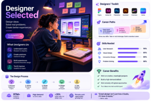
Mid-Level Designer
Mid-level designers take ownership of larger design challenges with meaningful autonomy. They lead design for features or products, conduct research independently, make design decisions and defend them clearly, and begin contributing to design systems and team processes. The transition from junior to mid-level is marked primarily by the ability to define and scope design problems, not just solve them once they are handed to you.
Senior Designer
Senior designers lead significant design work across a product area or multiple features, establish design patterns and standards, mentor junior and mid-level designers, collaborate closely with product management and engineering leadership, and advocate effectively for design and for the user perspective in decision-making processes. Senior designers are expected to bring strategic thinking to design challenges — understanding how design decisions connect to broader product and business objectives.
Lead, Principal, and Design Leadership
Design leads and principals set design direction for an entire product or product line, establish the team’s design philosophy and working practices, recruit and develop design talent, and represent design at the executive level. The transition to design leadership involves a shift from being primarily a practitioner to being primarily an enabler of other practitioners — which requires a different set of skills including management, organizational influence, and strategic communication.
Head of Design, VP of Design, and Chief Design Officer roles involve overseeing entire design organizations, setting company-wide design strategy, building design culture, and ensuring design has genuine influence over product direction at the highest organizational level.
Specializations Within Design Worth Exploring
As your career develops, specializing in one of the following areas creates differentiation and opens access to roles that generalist designers cannot target effectively.
Service design extends design thinking beyond digital interfaces to the complete service experience — including physical touchpoints, human interactions, and organizational processes. Service designers map complex service journeys, identify pain points across channels, and design improvements that span digital and physical experience.
Design systems specialization involves building and maintaining the component libraries, style guides, and documentation that allow large design teams to work consistently and efficiently at scale. As organizations have grown their design teams, design systems have become a recognized specialty with dedicated roles and significant organizational value.
Motion design and animation is a growing specialization as the expectations for polished, animated interfaces have increased. Motion designers create the animations, transitions, and micro-interactions that make interfaces feel alive and responsive.
Accessibility-focused design involves deep expertise in designing for users with disabilities — visual impairments, motor impairments, cognitive differences, and others. Accessibility expertise is in growing demand as both regulatory requirements and genuine ethical commitment to inclusive design become more prominent.
Conversational and voice UI design covers the design of chatbots, voice assistants, and other non-visual interfaces — a growing area as AI-powered conversational interfaces become more prevalent across consumer and enterprise products.
Conclusion
UX and UI design is one of the most genuinely human-centered professions in the technology industry. The work is ultimately about understanding people — how they think, what they need, where they struggle — and using that understanding to build products that serve them well. This is not work that can be reduced to a checklist or automated away, because the human judgment required to empathize with users, define problems clearly, generate creative solutions, and make principled visual decisions is irreducibly complex.
The path into this profession is accessible from many starting points, is supported by an unusually open and generous community of practitioners who share their knowledge freely, and rewards those who combine genuine curiosity about human behavior with the visual craft and communication skills to translate that curiosity into excellent design.
Build things. Test them with real users. Learn from what you find. Develop your visual craft deliberately. Document your process clearly. Engage with the design community. And above all, remain genuinely interested in the humans whose lives your design work touches — because that interest, more than any tool or technique, is what separates good designers from great ones.
